Colours of 2019
Retail
311 week ago — 6 min read
Background: Executive director of the Pantone Color Institute and colour expert for the International Housewares Association (IHA), Lee Eiseman, shares the colours that will dominate this year.
We must be especially clever when trying to attract consumers’ eyes with colour. The bar has been raised across many industries to really create some fabulous colour combinations and patterns. Trends don’t go away in one year. So, while one colour might remain popular for a few years, it’s more about constantly reinventing colour combinations to attract attention. The latest updates and directions in each of the colour families are as follows:
Reds: Red has always been a perennial favourite in the housewares industry, but the cleverness of the red today and the tone and psychology of it is important to consider. Red implies physical action and energy, as well as style and glamour. If you want to convey heat, you should use a warmer tone or a ‘truer’ red (with both warm and cool tones). Bluer reds imply a certain amount of sophistication.
We must be especially clever when trying to attract consumers’ eyes with colour. The bar has been raised across many industries to really create some fabulous colour combinations and patterns.
Pinks: Don’t forget pinks are actually part of the red family, though there are many layers and many levels of pink. Today, pinks are being used much more in all rooms of the home, not just bedrooms or bathrooms. They’re also being used in unexpected products such as audio speakers. One of the most interesting trends in display and online is using the combination of earth tones and hot pink.
Also read: The psychology of colour and its importance in marketing
Oranges: Terracotta tones, when used in either the background or the foreground, really have become classics. When it comes to peach, using ‘just a tinge of peach’ is hot in the fashion world. Coral can be seen in everything from ear buds to mopeds.
Yellows: Yellow has become so strong in fashion that it’s seeping into other colour families. Because of its association with sunshine, anything that has a yellow base to it certainly can help to enhance the mood. Yellows that are ‘honeyed’ down are generally the most preferred in the U.S., and mustard tones have been trending in the last few years.
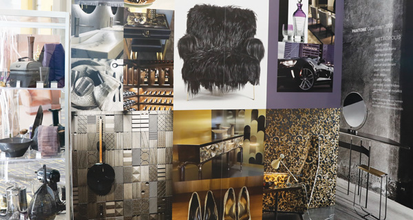
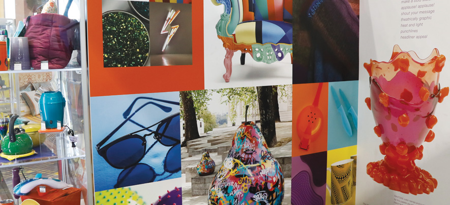
The Pantone stall at IHA depicts colour preferences
Greens: One of the most interesting developments in this family is the popularity of Avocado. Wildly popular in the 1970s (and largely on the outs since then because of that connotation), the Avocado toast in particular – is currently one of the darlings of the food industry. ‘New’ and ‘fresh’ are the most common responses to the colour in word association studies today.
Blues: One of the more unusual but eye-catching combinations in the blue family is turquoise and avocado. A hue coming back very strong on fashion runways is a deep indigo blue. And, something new to consider: You don’t see blue-purples as much in the housewares marketplace, but it always comes up very strong in surveys.
Purples: Redder purples add energy, and deepening a purple adds a restful connotation. Lavenders and violets today are almost always linked to relaxation, while mauves with greyed undertones can become a beautiful neutral.
Also read: Give AI a chance
Browns: Brown today conveys a sense of richness or a natural vibe. Browns with greys can be an absolutely stunning combination in homes and in fashion.
Greys: Greys are a dependable classic, but the newest trend in the grey family is charcoals, which are very deep and very sophisticated in feel.
Black and White: Everyone loves the combination of black and white. There can be a bit of tension created when you combine black and white, but that’s not necessarily a bad thing. Creating tension actually can attract attention.
Metallics: There’s so much being done with metallics, especially silver, chrome, nickel, brass and very shiny gold. (Copper is one metallic colour, which is not as on-trend for the coming years.) Foil treatments are popular, as are metallics with green undertones and striated presentations.
Also read: It's about the story
Article published in STOrai Magazine. Based on the second keynote “Color/Texture/Finish: Back to the Future” by Leatrice Eiseman – executive director of the Pantone Color Institute and colour expert for the International Housewares Association (IHA), delivered at the 2019 International Home + Housewares Show (Now known as The Inspired Home Show). www.housewares.org
Disclaimer: The views and opinions expressed in this article are those of the author and do not necessarily reflect the views, official policy or position of GlobalLinker.
Network with SMEs mentioned in this article
View STOrai 's profile
Other articles written by STOrai Magazine
The Art & Science of People Pleasing in Retail
22 week ago
Most read this week




Comments (2)
Share this content
Please login or Register to join the discussion